









ServicesUI/UX design
Design you can tap.Research, flows and a clickable prototype before any code.
We find out who uses your product and what they need to get done, then design every screen around it. You approve a prototype on your own phone before we build a thing.
Email admin@mastersoftware.io. A team member will respond within 24 hours.
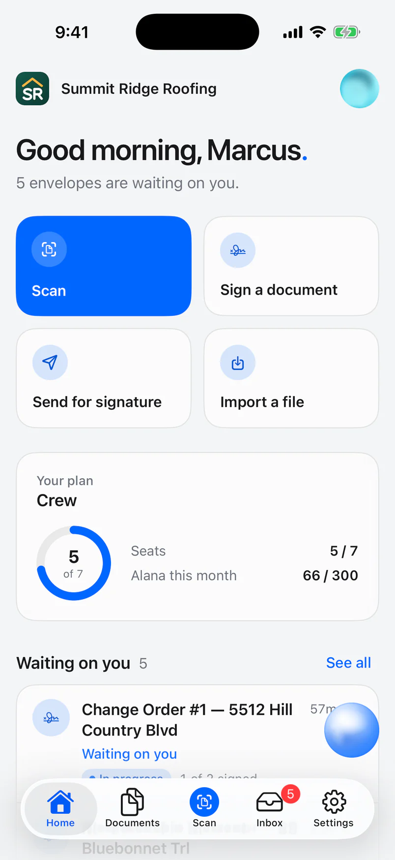
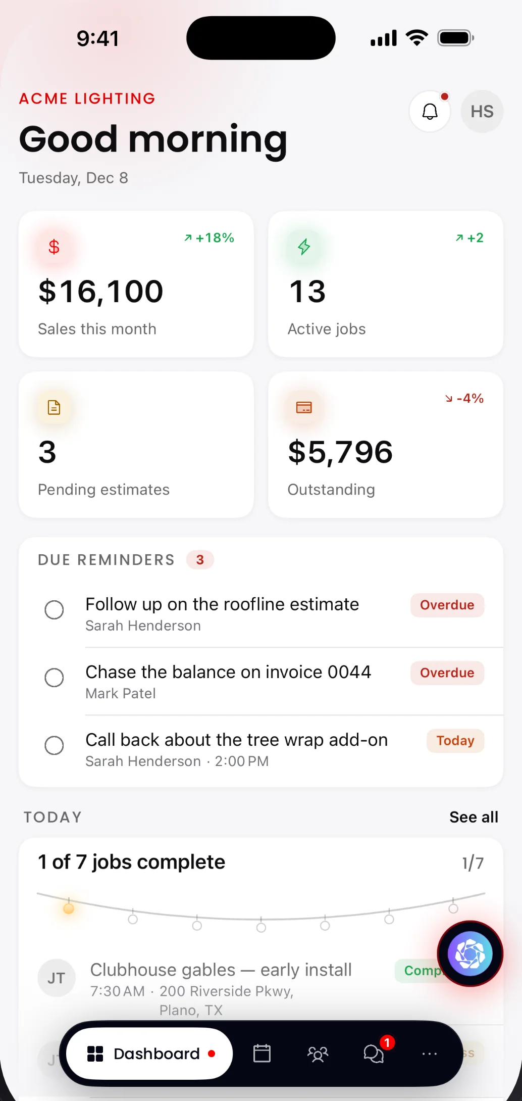
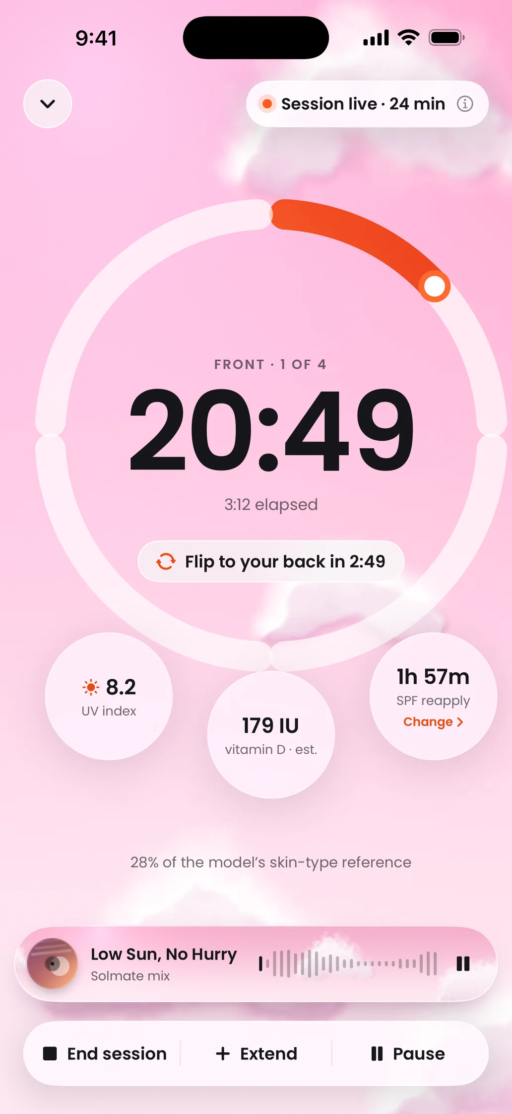
 SignMasterHome
 SolmateSession timer
 LightMasterDashboard
Wireframe to final screen
Structure first.Then the look.
We agree on what goes on each screen in plain grey boxes before anyone picks a colour. Moving a box takes minutes. Redrawing a finished screen takes much longer.
The wireframe decides
- What's on each screen
- The order people read it in
- What they tap next
Visual design adds
- Type, colour and icons
- Real content and data
- Motion, states and dark mode
Shown: Solmate's Today screen, wireframe and shipped design.
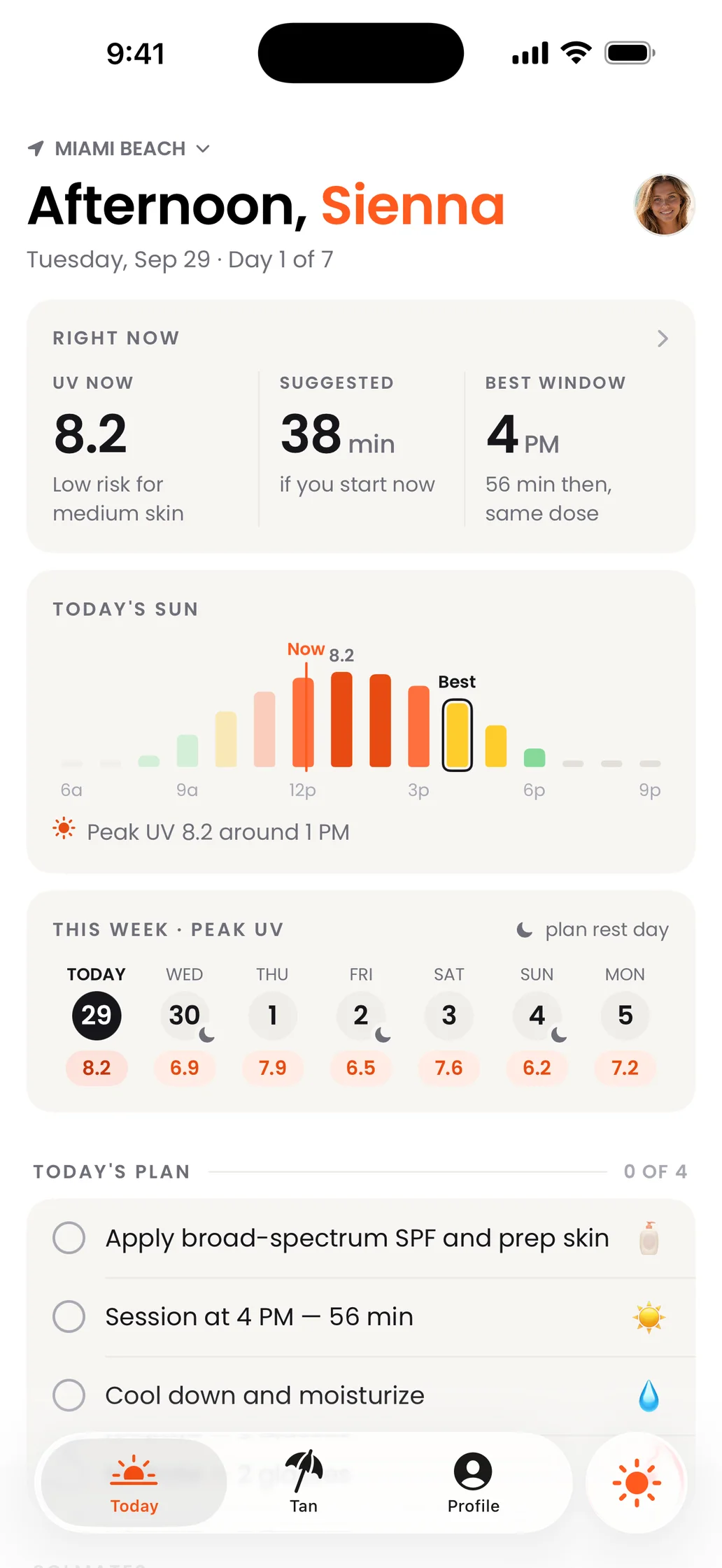
Drag the handle, or use the arrow keys.
Six stages.You review every one.
Each stage ends with something you can look at, comment on and approve. Nothing moves to the next one until you're happy.
- 01
Discovery and research
What we do
We learn the business goal, who the users are and what they're trying to get done. We talk to you and, where we can, to a few real users, and we take apart the competitors they'd compare you with.
What you get
- Goals and success measures
- User profiles and their top tasks
- A competitor teardown
- 02
User flows and structure
What we do
We map every path through the product, from first open to the job done, and decide what lives where. This is where we cut steps and settle the navigation.
What you get
- User flow diagrams
- A screen inventory and sitemap
- Navigation and naming
- 03
Wireframes
What we do
We sketch each key screen in plain grey boxes so we can agree on content, order and actions before anyone talks about colour. Big changes are quick here.
What you get
- Wireframes of every key screen
- Notes on behaviour and edge cases
- Empty, loading and error states
- 04
Visual design and a design system
What we do
We bring in type, colour, icons and imagery, then turn the decisions into a reusable system, so screen forty looks like it belongs with screen one.
What you get
- High-fidelity screens for phone, tablet and web
- Light and dark mode
- A design system with tokens and components
- 05
Prototype and usability testing
What we do
We link the screens into a prototype you can tap through on your own phone, then watch real people try the main tasks and fix what trips them up.
What you get
- A clickable prototype
- Test notes with what we changed
- Sign-off before any code
- 06
Developer handoff and design QA
What we do
We hand developers specs, assets and motion notes, answer their questions, then check the real build against the design on real devices before launch.
What you get
- A ready-to-build design file
- Exported assets and motion specs
- A design QA pass on the build
Deliverables
Everything you needto build it right.
Pick the pieces your project needs. Every file is yours to keep.
User flows
Every path through the product drawn out, from first open to the job done, so missing steps show up early.
Wireframes
Plain grey layouts of each key screen that settle content, order and actions before any visual design.
High-fidelity screens
Pixel-ready designs for phone, tablet and web, in the sizes your users actually have.
A design system
Type, colour, spacing and components with names your developers can build straight from.
Dark mode
A full dark palette designed alongside the light one, checked screen by screen.
Clickable prototypes
Linked screens you can tap through on your own phone and share with your team before any code.
Motion specs
Timing, easing and reduced-motion behaviour for every transition, written down for developers.
Accessibility review
Contrast, tap targets, text sizes and screen-reader labels checked against WCAG guidelines.
App Store screenshots
Store listing images built from your real screens, sized for every device Apple asks for.
Design systems
A system behindevery screen.
Here's the one behind this website. Every page you're reading uses these type sizes, colours and shapes, which is why a new page looks like it was always here.
Type · Manrope
- Display800 · 5.6rem · −0.055emLet's build it.
- Heading800 · 3.5rem · −0.03emQuestions? Answers.
- Lead500 · 1.32remTell us what you need.
- Label700 · 11px · +0.13emWhat you get
Colour
- Ink#1d1d1f
- Muted#6e6e73
- Faint#86868b
- Line strong#d2d2d7
- Hairline#e5e5ea
- Grey band#f5f5f7
Shape
- PillEvery button
- 24–28pxCards and tiles
- 1px hairlineInstead of shadows
Components
- Content width
- 1120px
- Gutters
- 20 → 24px
- Section padding
- 96 → 128px
- Breakpoints
- 640 · 768 · 1024
Our own products
Real screens.Designed by us.
LightMaster, SignMaster and Solmate were designed by the same team that would design yours. Here are a few of their screens.
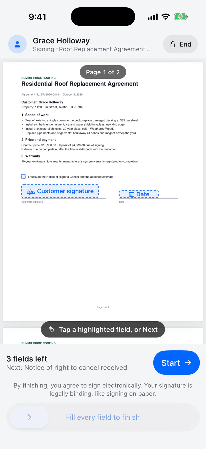 SignMasterIn-person signing
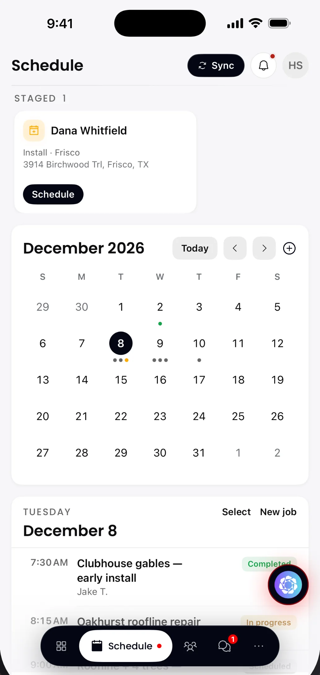 LightMasterInstall schedule
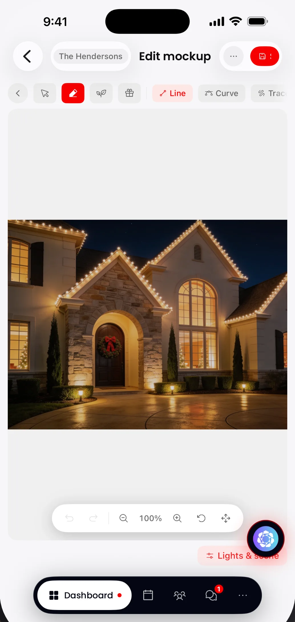 LightMasterMockup editor
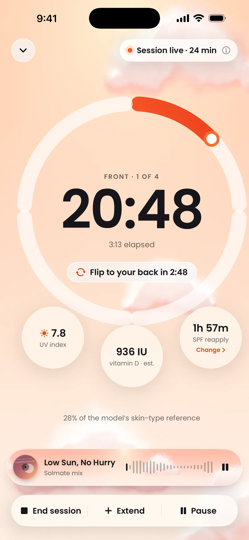 SolmateLive session
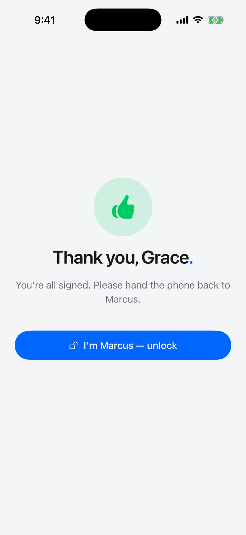 SignMasterSigning done
What we design by.Four rules we keep.
Clarity over decoration.
Each screen has one main job and one obvious next step. If something doesn't help a person finish the task, it comes out.
Accessible from the start.
We check contrast, tap-target size, larger text settings and screen-reader labels in the first draft, when they're cheapest to get right.
Motion with a purpose.
Animation shows where something came from and where it went. Anyone who turns on Reduce Motion gets the same app, standing still.
Design for the real data.
Long names, empty lists, slow connections and big numbers go into the design early, so screens still hold up on a busy day.
Questions? Answers.
Do you only design, or do you build it too?
Both. We design and build, so the people who drew the screens also check the finished app against them. If you have your own developers, we hand off a ready-to-build file and stay on to answer their questions.
What tools do you use?
We design flows, wireframes, screens and clickable prototypes in standard design tools, and you get the source files. When a flow depends on live data or motion, we prototype it in code with SwiftUI or React so you can try the real thing on your phone.
How many rounds of revisions do I get?
Every stage ends with a review, and your written plan sets the number of revision rounds before we start. We push for the big decisions at the wireframe stage, where changes are quick.
Can you redesign my existing app?
Yes. We start by reviewing what you have with you and your users, keep what works and fix what trips people up. We can rebuild it too, without losing your data. Our Platform refresh service covers that end to end.
Do I own the design files?
Yes. At handoff you get the source files, the design system and every exported asset, ready for any team to build from.
Do you design for Android and the web?
Yes. We design for iPhone, iPad, Android and the web, and follow each platform's own patterns so the product feels at home on every device.
How long does a design project take?
It depends on the number of screens and how much research the product needs. A single flow or a landing page can take days. A full app with a design system takes longer. Your written plan has the timeline.
Let's design it.
Tell us about your product and who uses it. A team member will respond within 24 hours.